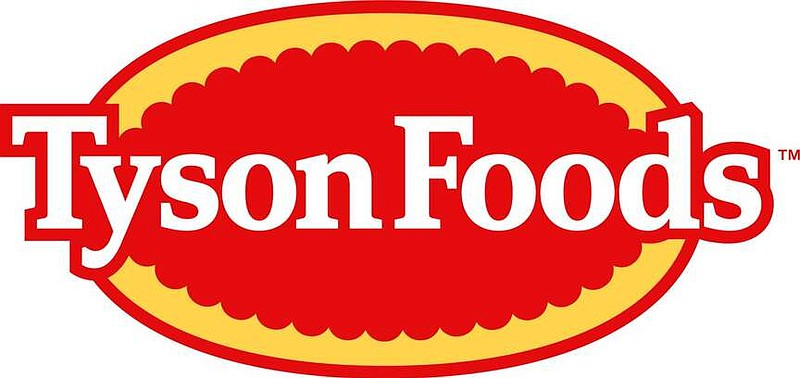
Tyson Foods Inc. is changing its logo for the first time since 2017, and the new design will be a familiar sight.
The Springdale-based company earlier this month announced the change in corporate brand to its 139,000 employees around the world, with the company shifting its corporate logo to the familiar red and yellow consumer-facing logo theme.
"Our new visual identity unifies our history and our future," the company said in a statement. "Almost ninety years ago, Tyson Foods began as a chicken company and today we have evolved into a world-class food company and recognized leader in protein."
The new logo uses the old style of Tyson logo, most recently used before the change to a blue "T" logo with an arrow through it in 2017. The blue logo was intended to usher in a new modern look, according to Tyson's brand evolution webpage.
A red base with a surrounding yellow circle along with "Tyson Foods" in white makes up the new logo.
The red oval logo had remained for Tyson's consumer brand, but now the company has brought it back for its corporate brand.
Previous Tyson logos, like ones used before the blue logo in 2017, followed a similar style. However, this is the first time this style of logo has been used with "Tyson Foods." The last time the company used the full name in a logo was 1972, a design which also included a chicken with a red top hat and cane.
Tyson said the logo will be used to communicate the purpose of the company: Tyson Foods.
"We feed the world like family," the company said. "Family anchors us in our legacy as a company dedicated to bringing high-quality food to every table in the world, safely, sustainably, and affordably, now and for future generations."

