And the color of the year is ... a salad?
Well, no, it's actually a field of greens, which we'll get to in a minute. But first this: When Behr Paint Co.'s marketing team emailed to say the company would announce its Color of the Year (known in design circles as the COTY), and its associated palette via a virtual cooking class with a celebrity chef, I was intrigued. (Palette, palate, get it?)
Food and design, talk about a perfect pairing.
Like most big paint companies, Behr annually announces its COTY after its color mavens predict what will be the "in" hue for the coming year. As contrived as these announcements are, I always look, the way I read my horoscope.
The chef angle — though a bit of a stretch — did put a fresh spin on a yawn-of-a story. Celebrity chef Curtis Stone would virtually guide a group of design reporters on how to make a salad while talking about color.
I dashed to the grocery store for the ingredients. Some I had never heard of (watermelon radish, pickled mustard seed). Some I had never bought before (fennel bulb, edible arugula flowers).
As Stone whisked the group through a demo of how to make a 15-ingredient salad, which included basil-pistachio vinaigrette dressing and grilled stecca-bread croutons, it quickly became evident why we're not food writers. I can't speak for the others on the call because I was too busy not keeping up. While I was slicing a watermelon radish into potato-chip-thin rounds, Stone was three steps ahead heating olive oil in a saucepan to 295 degrees. Long after he'd finished straining the basil oil, I was still upending my kitchen looking for cheesecloth.
But I did hear him say: "As chefs, we think constantly about color. When we see a variety of color on a plate, it screams, 'fresh!'" By the end of the demo, Chef Stone's artful salad was colorfully tossed into one camera-ready masterpiece, while my ingredients weren't even in the same bowl.

All so I could experience the Color of the Year. So what is it? Well, it's a bunch of mixed greens. Several companies announced their 2022 COTY over the past few weeks, and while their picks are unique, cool soft greens headline in every case.
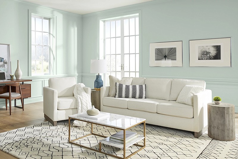
Behr, a brand sold at The Home Depot, picked Breezeway (MQ3-21), "a silvery green shade with cool undertones," according to the press materials. "Breezeway evokes feelings of coolness and peace while representing a desire to move forward and discover newfound passions. Leading you from one place to the next, the color catches your attention and is an open invitation to experience the world with a fresh perspective ... ."
Sounds more like a cruise ship than a paint chip.
PPG, the Pittsburgh-based paint company, named Olive Sprig (PPG1125-4), "an elegant, grounded, versatile and highly adaptable gray-green, this color represents regrowth in a post-pandemic world, mimicking nature's resiliency," said PPG spokeswoman Amy Donato in a statement. "With our society in a state of reflection, hope and optimism, consumers are gravitating toward more colorful selections, like Olive Sprig."
In its 2022 forecast, Farrow & Ball, a British paint brand, tagged Breakfast Room Green (No.81), which is actually close to the color of my basil-pistachio vinaigrette.
Of note: Each of these brands is pairing its chosen green alongside shades of creamy beige and retro brick red. Behr is showing Breezeway alongside Whisper White (HDC-MD-08), and Perfect Penny (S180-6). Farrow & Ball with School House White (No.291), and Incarnadine, a rich crimson (No.248).
So what are we to make of these trends and why should we care?
◼️ Where do color trends come from? Although this COTY business seems like a marketing gimmick, the predictions do not come out of nowhere. Color forecasters from around the globe meet annually to discuss what is going on in the world socially, artistically and politically, then predict what hues consumers are going to feel like wearing, driving and living with. This helps designers and manufacturers get in lockstep, and make merchandise that goes together. So you can find a bathmat to match your hot pads and your handbag, if you're so inclined.
◼️ Does the market anticipate what we want, or do we want what's in the market? I don't know either. It's a chicken-and-egg conundrum. What I do know is that these color campaigns are intended to get consumers thinking about painting or repainting their homes. And I'm glad they do. How boring would life be if color didn't cycle through fashion, home, and, yes, food? (The unfortunate comeback of beets notwithstanding.)
◼️ They are just trends. Don't rush out and redesign your house around the color of the year unless you are planning to remodel, and you love the new color. Being aware of the COTYs are like watching a runway fashion show. Just because the models are wearing fur-trimmed neon hot pants with suspenders doesn't mean you have to. A color is only meaningful if it works for you.
◼️ Look beyond the paint to the palette. Just like certain wines pair well with specific foods, color depends on the company it keeps. Paint companies are exceptionally good at creating palettes, clusters of colors that work together to bring out the best in each other. Take note of what paint companies suggest you put their feature colors with. Like a good salad, a successful color lies in the mix.
◼️ Once you see it, you can't unsee it. Tuning into color trends makes you a better observer of how color moves in the world. Watch. The same phenomenon, which psychologists call frequency illusion, that happens when you get a new car then see it everywhere you go happens once you know the "in" colors. Trust me. This color or versions of it are about to pop up everywhere.
Marni Jameson is the author of six home and lifestyle books, including "What to Do With Everything You Own to Leave the Legacy You Want."